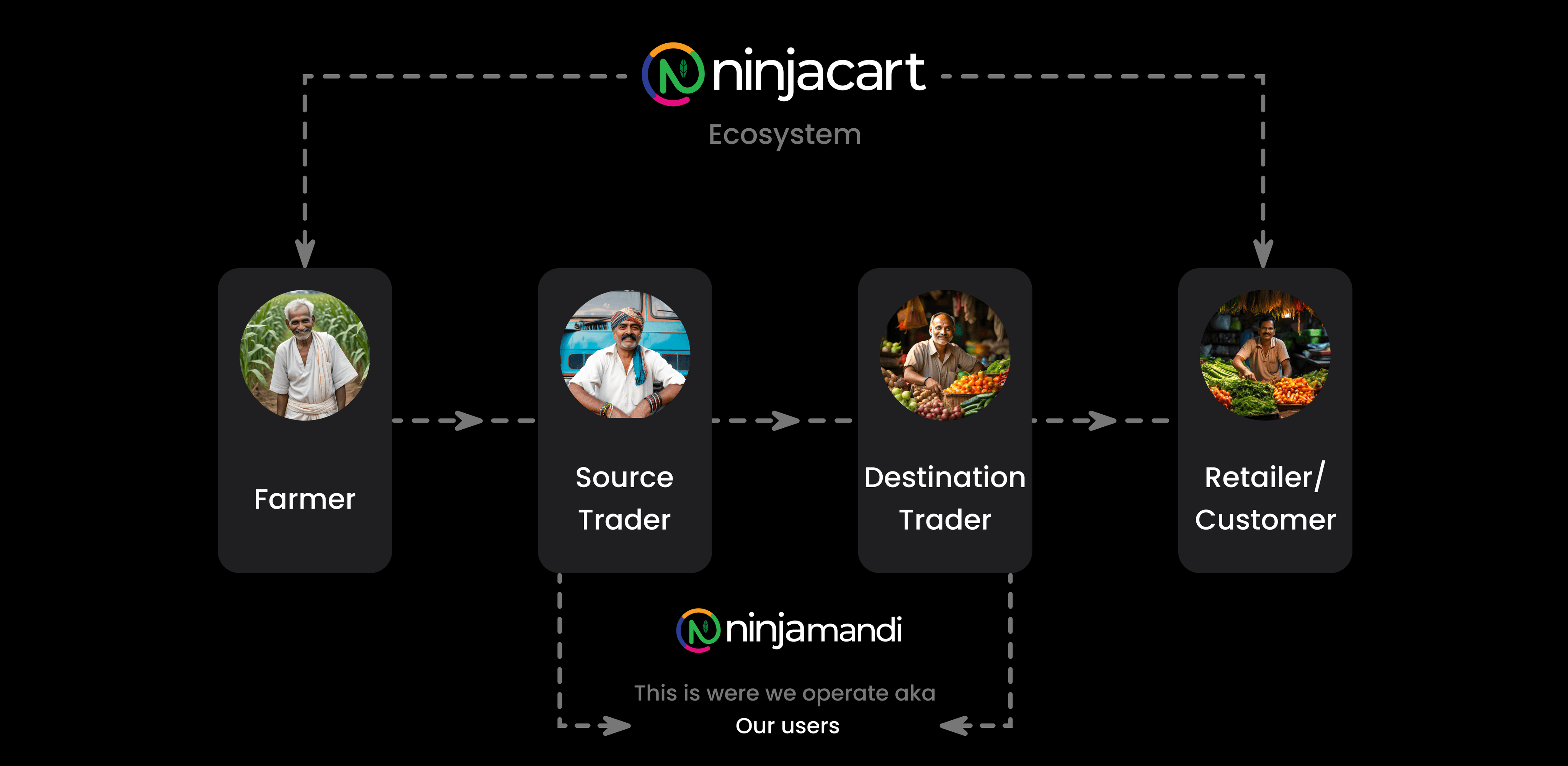
Ninjacart is a leading agri-tech company in India, specialising in transforming the fresh produce supply chain. The company connects farmers directly with retailers, restaurants, and other businesses through an efficient, technology-driven platform. By eliminating intermediaries, NinjaCart ensures fair prices for farmers and fresh, high-quality produce for consumers. Additionally, NinjaCart provides financial support to resellers and retailers, offering them credit.
My Role
Product designer -
Interactions, User Flows, Prototyping, Research and testing
Team
Product Manager - 01
Frontend Developer - 01
Duration
3 weeks
Overview
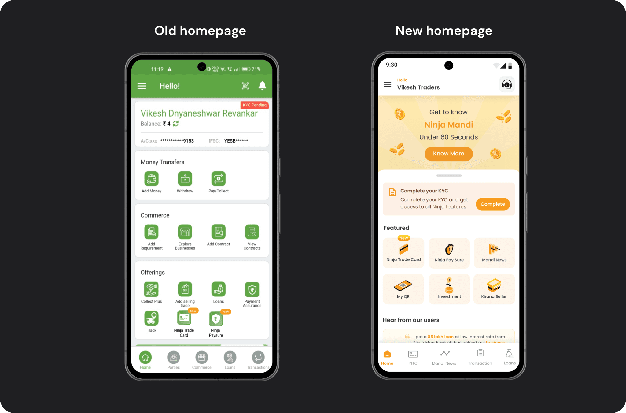
The challenge was to declutter the homepage, improve the visibility and accessibility of prime features, and align the design with new brand guidelines. This case study outlines the research, design process, final implementation, potential impacts, and key learnings from the revamped homepage project.
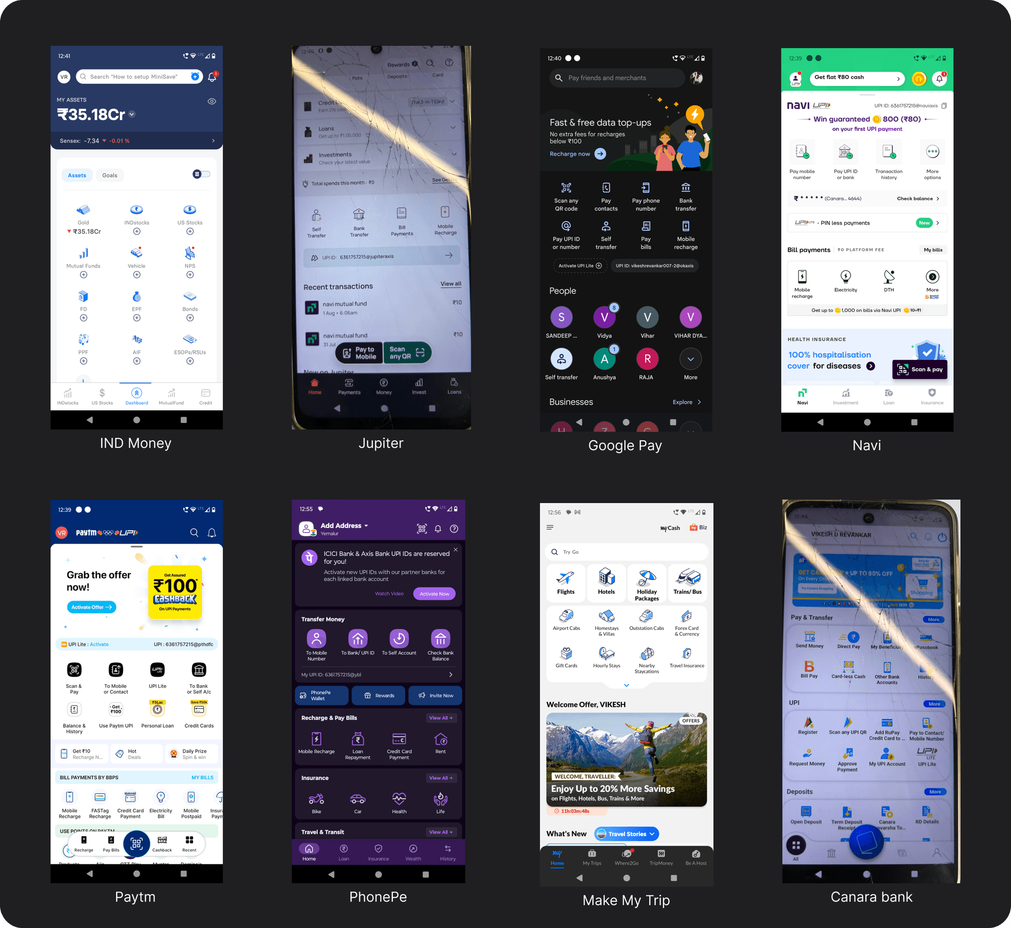
We began our research by analysing competitors and engaging in ongoing conversations with our users. We initiated the competitive benchmarking process to identify gaps in Ninjacart's user experience. The apps we chose for comparison aren't direct competitors, but they are used by our users.
Competitors analysis (Secondary Research)
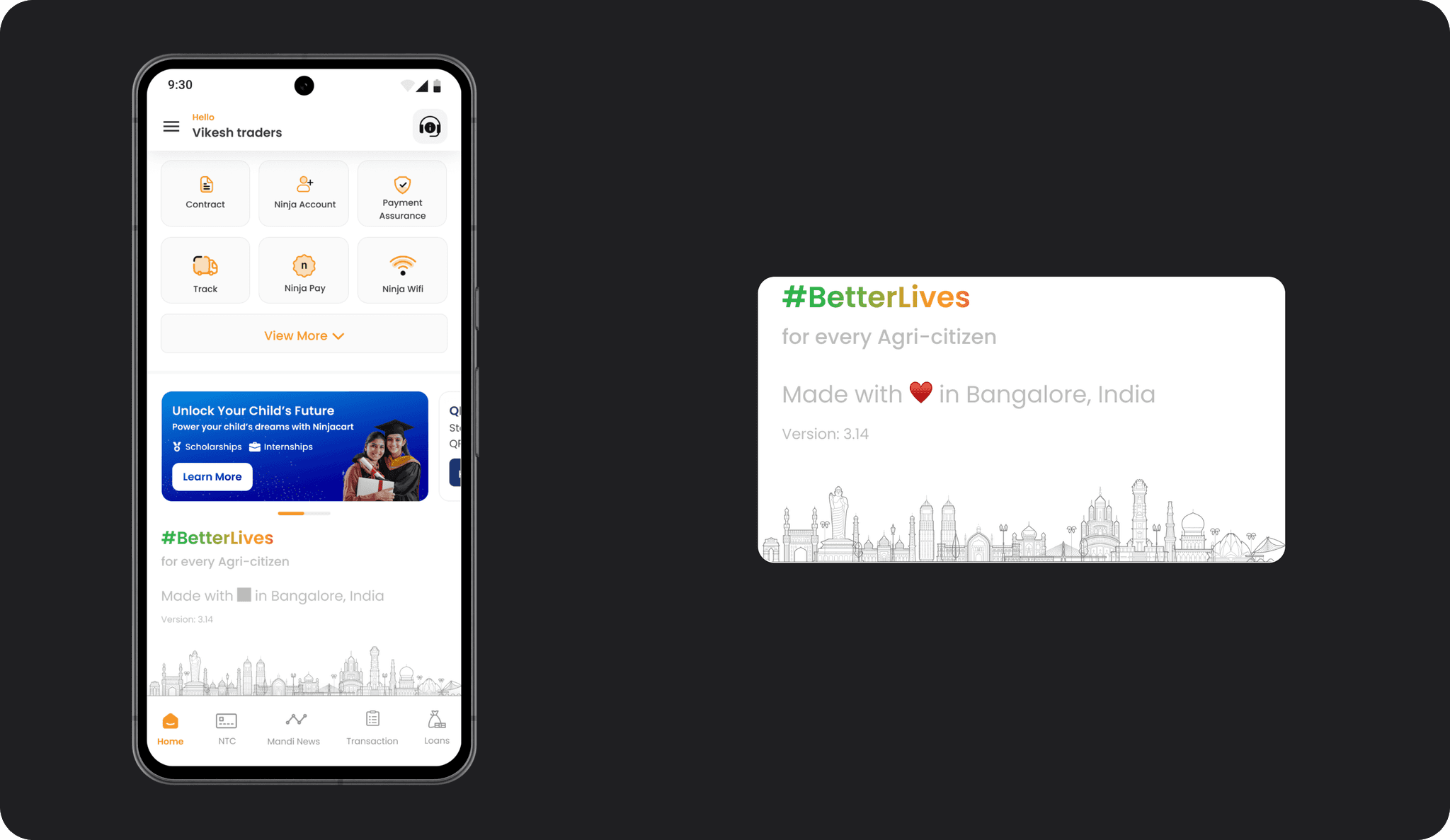
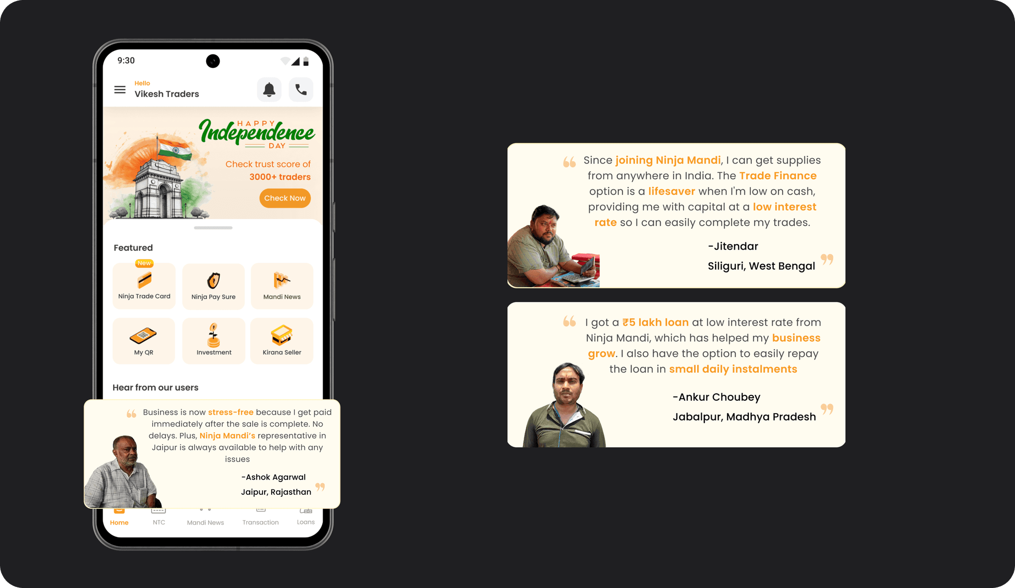
Promotional Banner
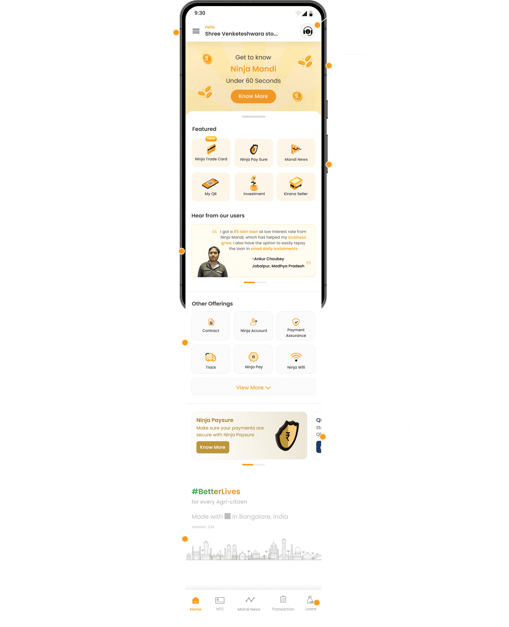
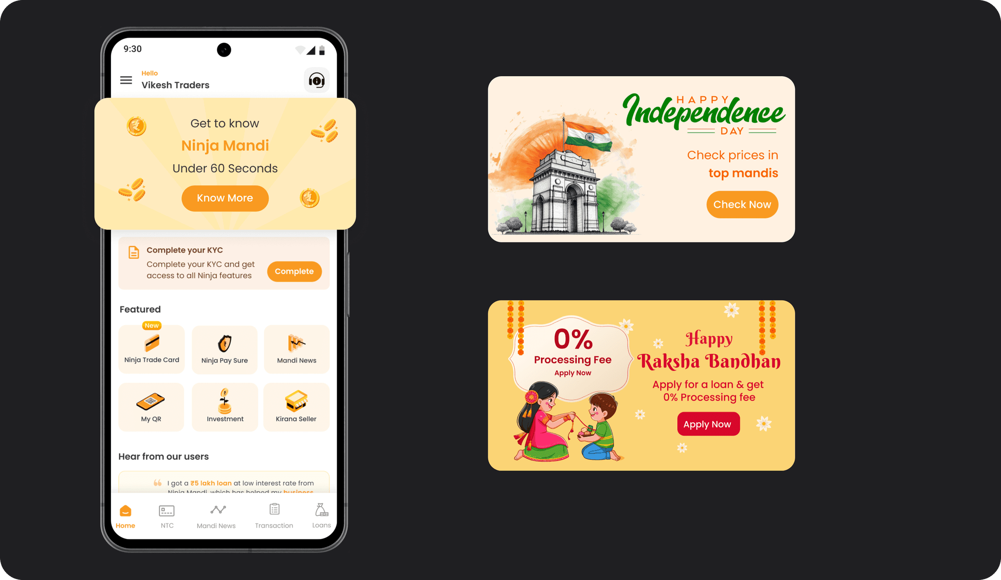
Instead of a conventional top banner, a larger section of the screen is dedicated to promotions. Data analysis revealed that only a few users clicked on traditional banners. For new users, this space is utilised as a help section to introduce Ninja Mandi’s features and processes through a story format. Initially planned as a video, due to time constraints, it now features static images. This section can also celebrate festivals, adding a touch of personalisation and engagement.
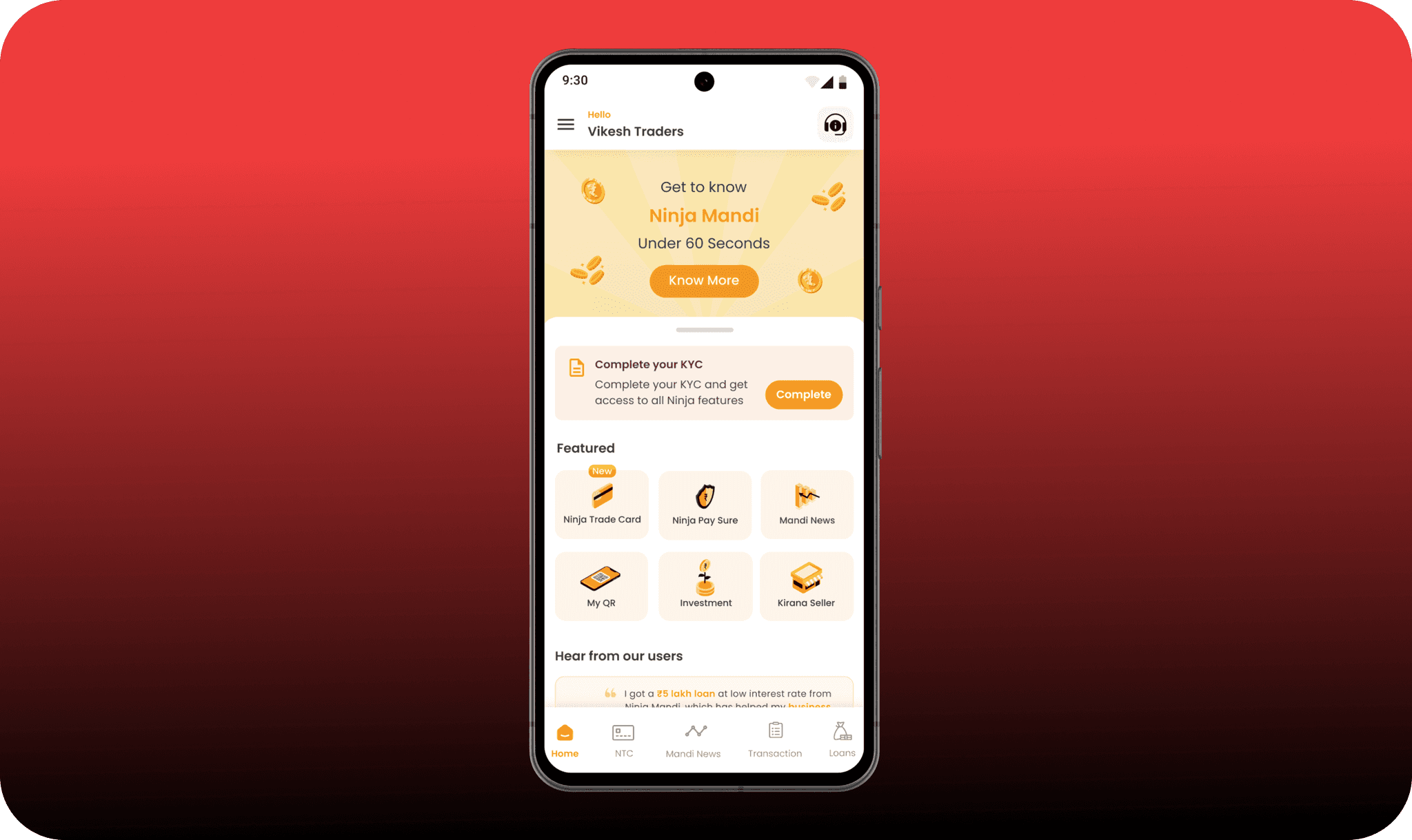
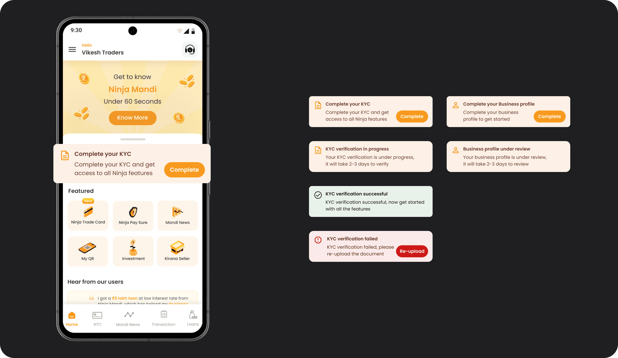
Alerts
This section is crucial for communicating important information such as KYC verification and loan application statuses. As a financial institution, ensuring users complete their KYC is paramount, and this section keeps them informed about their progress.
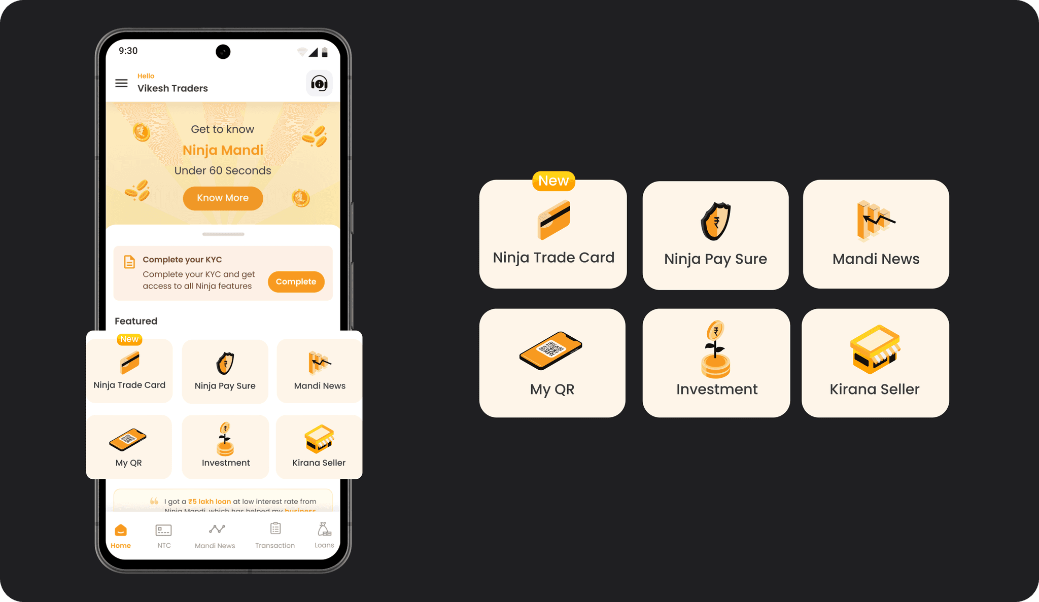
Featured Section
Major features are prominently displayed using isometric icons, differentiating them from other features which use flat dual-tone icons. This design choice stemmed from competitor analysis, where it was observed that distinct icon styles help in highlighting key features effectively.
Testimonials
Previously absent, the testimonials section was introduced to build trust. During user research across cities like Bengaluru, Pune, Kolkata, and Aurangabad, it was evident that users take pride in their achievements. For example, a trader in Bengaluru proudly displayed a certificate he won in a competition. Reflecting this pride, the testimonial section showcases three testimonies along with pictures of top traders from various markets, based on the user’s location permissions.
Footer
The footer reinforces Ninjacart's mission, “Better Lives,” with an image of an Indian monument, emphasizing the "Made in India" ethos. This addition strengthens the brand's vision and its connection to the local market.